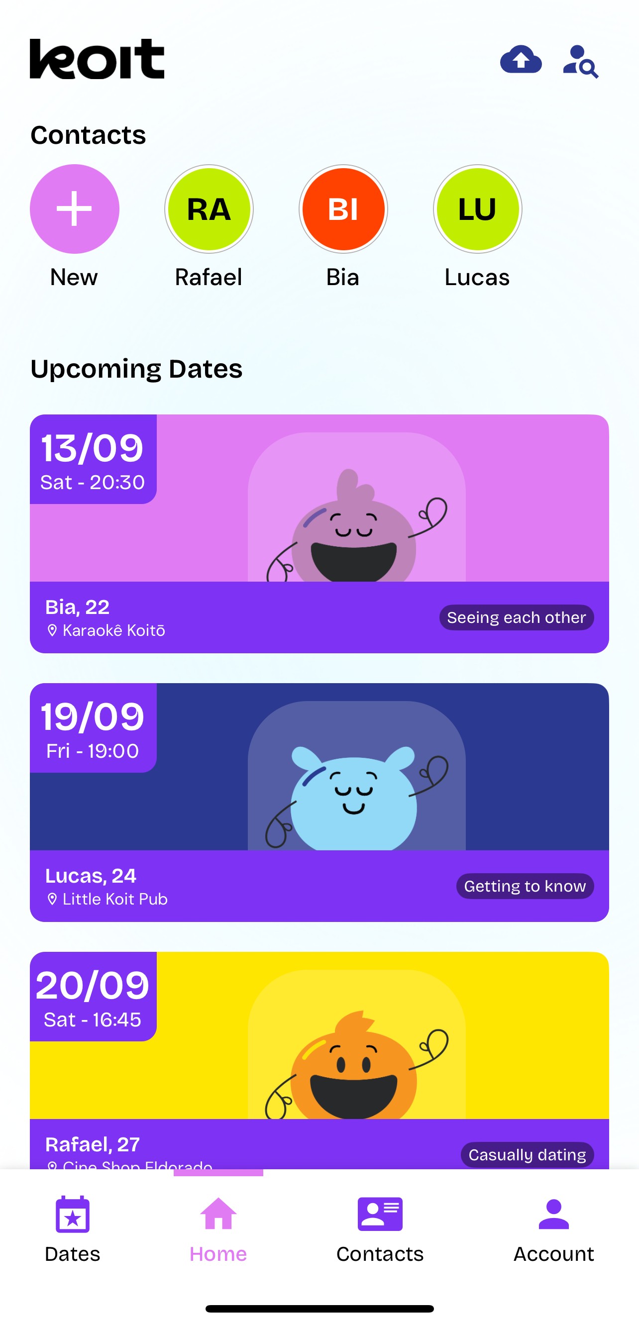
Your dating life, organized.
Koit is the contact and date manager for busy dating lives. It's not a matching app: we don't make the match, we help you not mess it up.
Why the details get lost.
One memory stays in your head, another in a chat screenshot, another in a calendar note. By the time the next date happens, the context is gone.
Forgetting names, preferences, and details that matter.
Dates and context scattered across chats, notes, and screenshots.
Doing manual, incomplete safety updates before leaving the house.
Safer dates with Trusted Friends.
People already send date details to friends manually. Koit structures that behavior inside the app. Choose which dates to share, send one-tap updates, and let trusted friends follow along.
Share date details
Send where, when, and who you are meeting in a single secure summary.
One-tap check-in & check-out
Let friends know you are doing well or have left the date in one tap.
Context when it matters
Safety through preparation, shared context, and the trusted people you select.
Start with the app. Organize at your own pace.
Personal notes written by you
No automatic conversation scanning. Just what you choose to write.
Important details at a glance
Birthdays, preferences, things they don't like — easy to remember who's who, even after months without talking.
Dating notes & history
Review what you talked about during past dates before you meet again.
Remember what makes each connection unique.
Save details you choose to record: preferences, important dates, stories, and notes. Koit is a dating CRM built around intentional connection.
Feel prepared before seeing someone again.
Plan who, where, and when the date is. Use Date Mode for quick context before or during the date, without digging through old messages.
Plan & organize dates
Plans, photos, spending per date, and average spending per contact.
Date Mode active
Quick access to preferences, history, and notes — right as you arrive.
One tap to reengage
Jump straight to their profile or chat window in your preferred app.
Koit organizes what matters to you.
It helps your dating and social life feel clearer without becoming a social network, matching app, or conversation reader.
Koit does
- ✓ Organize contacts and dates
- ✓ Keep notes and reminders written by you
- ✓ Makes your dates safer with Trusted Friends
- ✓ Work with complete privacy and user control
Koit does not
- × Match people
- × Guarantee absolute safety
- × Replace emergency services
- × Track or surveil anyone
Built for safety, easy to use.
- MFA protects every login with an extra security step.
- PIN/biometric lock helps protect the app from people who should not see it.
- Trusted friends can follow your dates, check-in and check-out times, and wellbeing updates. Restrict certain dates to keep them secret.
- Individual selection lets you bring in only the contacts you choose.
For legal detail, refer to the Privacy Policy.
An app for remembering people, not turning dates into spreadsheets.
The details you remember, the privacy you respect, the friends you keep in the loop — that is what caring for connections actually looks like.
Quick questions before downloading.
Is Koit a dating app?
Yes, Koit is a dating app. It is not a matching app. Koit organizes people, dates, friends, and details you already have. In other words: you match elsewhere, and we help you keep the match.
Does Koit show other people's profiles?
No. There is no public profile browsing, social feed, or stranger discovery. However, approved trusted friends may see certain details with the user's permission.
Does Koit read my conversations?
No. Notes and details are recorded or imported by the user's choice.
Why add a trusted friend?
So someone you trust can follow your dates, see check-ins and checkouts, receive wellbeing updates, and have important information if you need support.
Why use it?
To remember details, feel more prepared, and care for connections without relying only on memory.
Want the full FAQ?
See the most important questions about the app, privacy, trusted friends, and organizing dates.
Organize your dating life with Koit.
Remember the details that matter. Keep trusted friends in the loop.